UXwasHere set out to be the home base for UX professionals — a space to connect, collaborate, and grow together. But somewhere along the way, it became everything at once: a job board, a social network, a portfolio tool. And in trying to be all of it, it stopped being any of it.
DELIVERABLE
Digital Prototype
TEAM
Elsa Sinuhaji Erika Hance Kobe Stimpson Linda Jolly
MY ROLE
Experience design Project management
DURATION
3 Days (2024)
TOOLS
Figma Adobe Illustrator Adobe Premiere Pro
At Eunoia 2024, a three-day design competition, my team was tasked with redesigning UXwasHere — but the brief was pointing at symptoms, not the real problem. I pushed us past it to reposition the platform entirely, led the strategic direction, and originated the core features we shipped. I'd also organized two weeks of preparation beforehand so we could move decisively once the clock started. The judges called it creative and innovative; the critique that followed taught me more.
THE problem
The client pointed to a diverse target audience and low retention as their core challenges, citing nearly 97% of visitors never moved past the landing page, and other pages received less than 1.6% engagement (Eunoia Design Brief, 2024). However, the more I dug, the more I realized those metrics were symptoms of a larger problem: by adding in redundant features, like job-search, to compete against larger competitors, UXwasHere had lost any clear identity or niche to create value for its intended community.
The Opportunity
Experience design advocates are surrounded by platforms, but many are built around career advancement, leaving little room for the kind of collaboration and problem-solving that actually make them better at their craft. We had the chance to fill a niche gap purely for collaboration and problem-solving, where community was the whole point. That's what UXwasHere was originally built to be, and what we designed back toward.
Through research, we learned the following insights:
1. Community is the missing platform
Experience design advocates are oversaturated with platforms that blend social media with career or corporate functions.
2. Collaboration without the career pressure
Experience design advocates desire but struggle to find meaningful spaces focused on building meaningful collaboration and connection in UX, outside of a professional environment.
3. Unfocused platform, disengaged users
Users of UXwasHere are frustrated by the platform's lack of focus, outdated tools, and broken functionality, which hinder meaningful engagement.
Insights were gathered through heuristic evaluation of UXwasHere, surveys, and competitor analysis (Design Buddies, ADP List, Iterate UX, PeerList, and LinkedIn).
The guiding question
How might we empower UX advocates in Vancouver to nurture community, meaningful connections, collaboration, and long-term growth in order to amplify their personal and professional impact?
OUR APPROACH
I structured three days around one conviction: that UXwasHere needed a rethink, not a refresh. Day one was for aligning on the real problem and exploring directions; days two and three for execution. I pushed to broaden the platform's audience beyond design professionals to anyone committed to creating better experiences — a deliberate expansion that gave the redesign a clearer purpose and a larger reason to exist.
research process
Through interviews, usability testing, and competitor analysis, one theme kept surfacing: users couldn't articulate what made UXwasHere distinct from ADPList, Design Buddies, or IterateUX — and several noted it felt less like a community and more like a founder's personal brand. At the same time, they weren't asking for more networking tools; they wanted meaningful collaboration outside of a professional context. That gap was the brief we actually designed for.
Through supplementary academic reading, I uncovered three design principles that guided our approach:
Establish Identitiy to Drive Engagement
Frame networking and digital connections as an extension of identity, both personally and professionally, to boost participation and engagement (Raj et al., 2017).
Create Shared Purpose
Foster emotional connections in digital spaces by enabling relationship-building and shared activities, while letting users engage at their own pace or depth (Tucker et al., 2022).
Distribute the Ability to Solve
Social platforms for good connect people, enabling collaboration and innovation by providing diverse voices and essential tools to solve problems together (Snissar Lobo & Zapata., 2022).
concept evolution
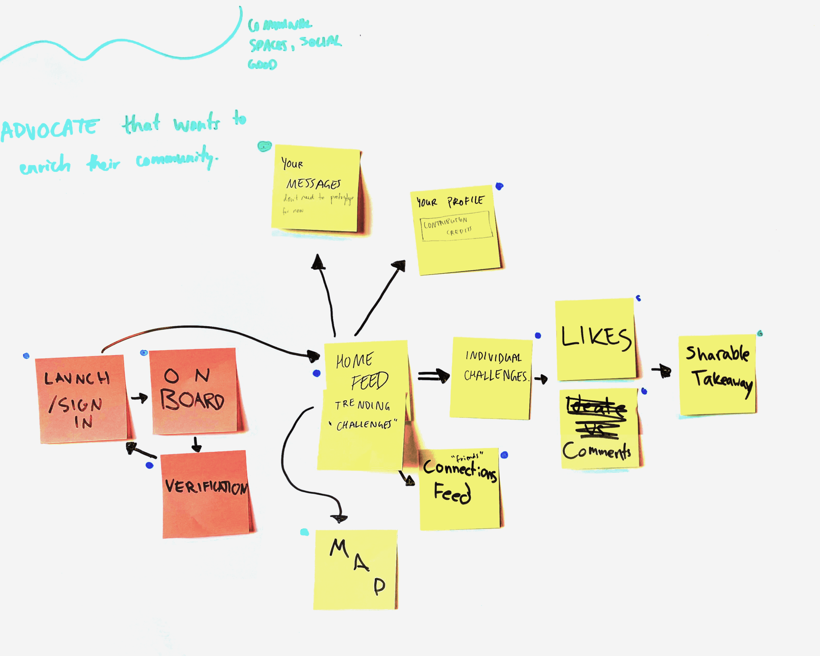
I started the team with Crazy 8s across mobile and desktop, leaving space to explore before committing to a direction. As concepts took shape, I made two deliberate scoping calls. I pushed us to desktop only: the experience we were designing for required focused, sit-down collaboration, and splitting effort across two platforms would have diluted both. I also narrowed our geographic scope back to Vancouver, where UXwasHere originally started. A global platform with no clear identity was part of the problem; a focused, local community was a more honest and achievable starting point.


design solution
The redesign centers on two features: Hurdles, real-world problems users solve collaboratively, and Lenses, identity avatars that reflect how each user thinks and problem-solves, both built to drive the genuine community engagement UXwasHere was missing.
Onboarding - Lens Buddies
Lens Buddies appear during onboarding as an early signal of what the platform values. Rather than centering careers, it centers perspectives.
Interviews revealed that users felt reduced to their professional identities. To address this, we introduced Lens Buddies during onboarding, allowing users to define themselves through perspectives rather than credentials. Since they persist across the experience, Lens Buddies are established during onboarding and carried forward throughout the platform, shifting profile set up to an identity-driven interaction rather.
Home Page - Hurdles
Users didn't need another feed to scroll, they needed a reason to come back and something worth coming back for.
Hurdles are collaborative design challenges rooted in real-world problems, placed at the center of the redesigned landing page. Every Hurdle invites community input, giving users a genuine reason to return and contribute — shifting the platform from passive browsing to active, shared problem-solving that no career-focused competitor was offering.
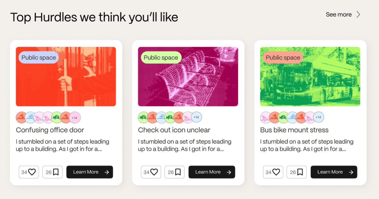
Suggested Hurdles based on user preferences
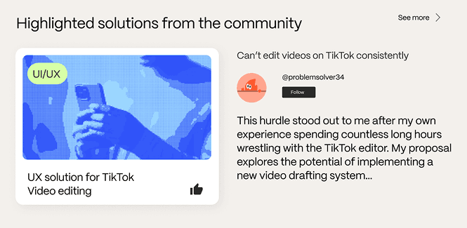
Highlighted community solutions to Hurdles

Suggested Hurdles based on users' Lens
Hurdles
Clicking into a Hurdle surfaces who solved it and how they think, not just what they built.
Each Hurdle reveals the problem space, the Lenses of contributors who've tackled it, and highlighted community solutions. Surfacing Lenses alongside solutions was a deliberate choice: it shows the background and perspective behind each approach, making collaboration feel human rather than transactional, and giving users a reason to follow contributors whose thinking resonates with their own.
A look into Community Solutions

Common Lenses that have addressed the problem
Vault Page
Vault turns individual solutions into shared infrastructure, so no one has to start from scratch.
Vault is an open-source library of assets, components, and resources contributed by the community to solve real Hurdles. Unlike a generic asset marketplace, everything in Vault is solutions-oriented — built in the context of a real problem, and shareable so others can build on it. It closes the loop between collaboration and contribution, giving users a tangible way to leave the community better than they found it.
Profile Page
Every feature has a home. and so does your problem-solving identity.
The profile brings it all together: your Lenses, Lens Buddy, top Hurdle zones, contributions, and saved assets in one place. It's less about who you are professionally and more about how you show up in the community.
Reflection
Don't be afraid to challenge the brief, but be prepared to justify why.
Leading this project taught me that good leadership is about balancing conviction with collaboration. We chose to push past small tweaks, instead going for a bold direction that challenged UXwasHere's original vision. While the judges praised our creativity, solution, and innovation, their feedback reminded me that it's not enough to question a client's assumptions; you also have to understand which parts of their vision are essential, and I hadn't fully considered that UXwasHere had limited resources, making our redesign a challenge to implement feasibly. Just as importantly, I saw how preparation shapes a team's ability to do its best work. Although the competition lasted just three days, I'm proud that I prepped for the event, allowing the team to focus on creating with alignment.