The Ordinary: Dictionary+
00
CONTEXT
Type
Experience Design (3 Week project for Junior Design Course at SFU SIAT)
Team
My Role
Concept Strategy, Content Design + Copywriting, UI Visual Design
Tools
Figma, Adobe Photoshop
An educational tool helping shoppers make confident choices.
The Ordinary is a leading skincare brand offering affordable and effective solutions that celebrate minimal ingredients communicated with integrity. Dictionary+ is a proposed feature for The Ordinary skincare brand, designed for a second-year information design course, educating users on the purpose and impact of ingredients found in their products.
01
PROJECT OVERVIEW
Understanding skincare consumers
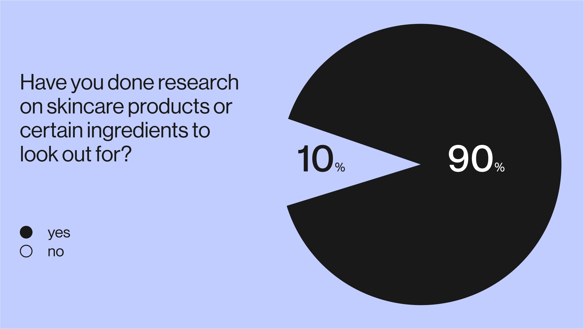
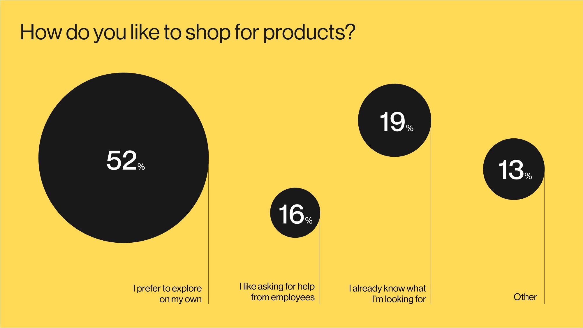
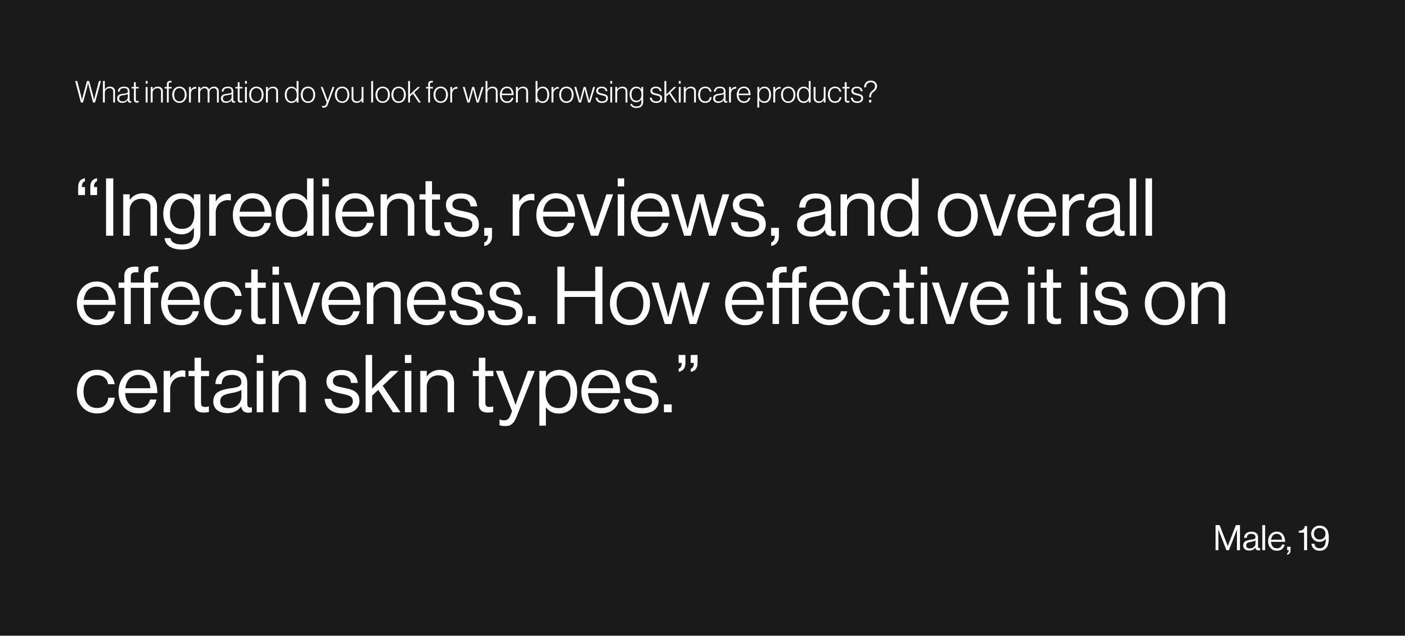
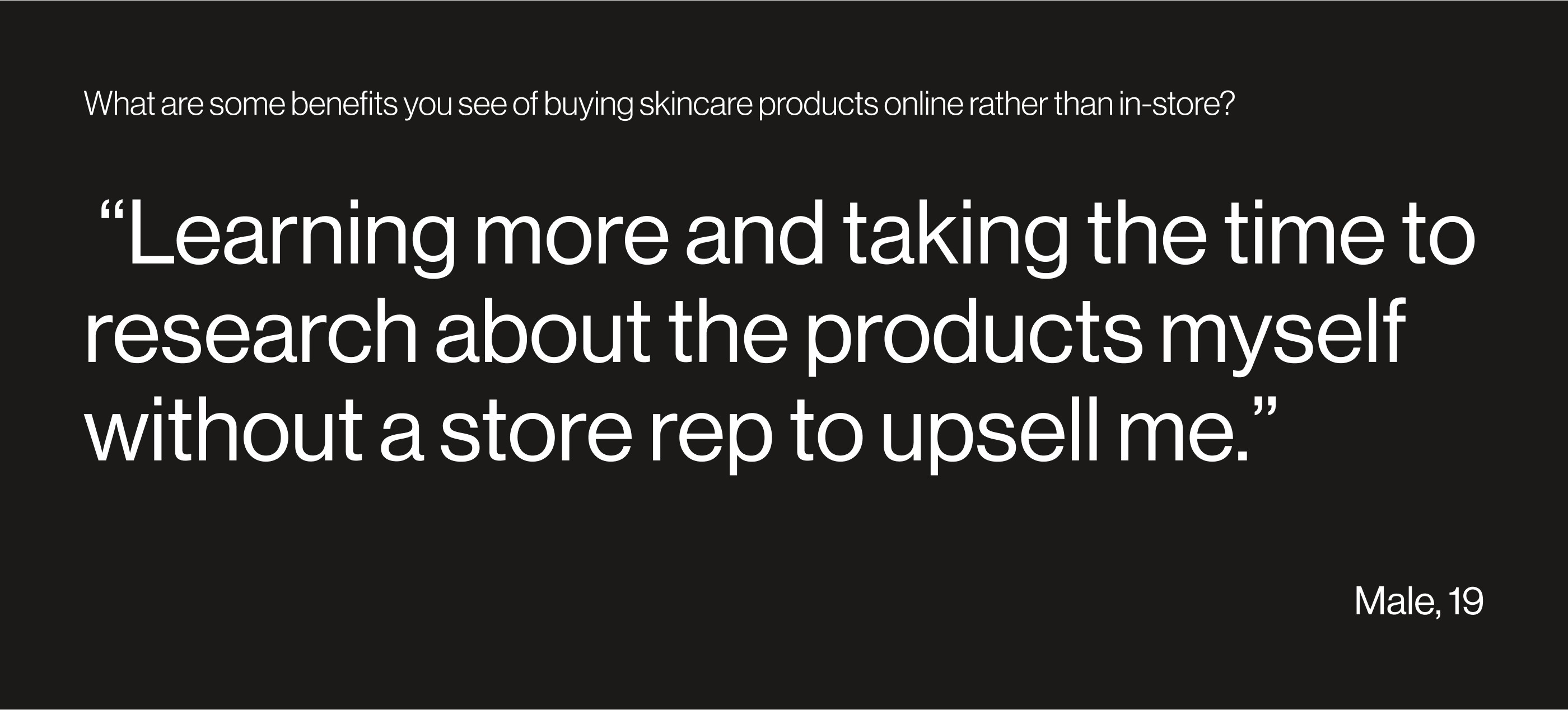
From the beginning, we sought to understand user habits and goals when shopping for skincare products, as well. To explore this, we put out a survey to get insights and received 88 responses.
Narrowing our target user
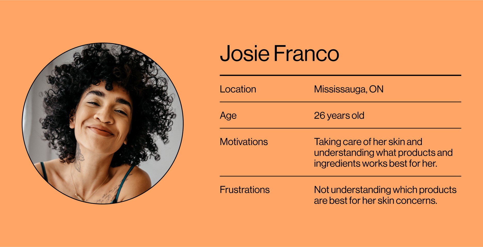
We decided to target users who have minimal skincare experience as their situation allowed the most room for educational intervention. These were people who have bought skincare products before but are unsure of the products and ingredients that best suite them.
02
FRAMING THE PROBLEM
How might we make skincare science more digestible for informed novices?
Evaluating existing features
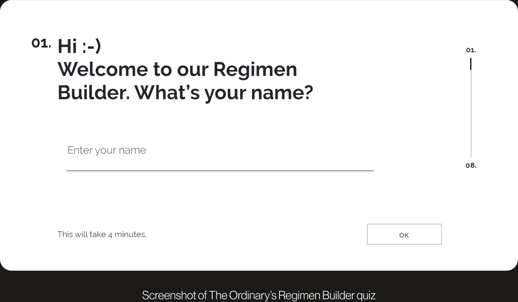
The Ordinary understands that choosing the right products can be a daunting task; their solution is the Regimen Builder, a quiz that chooses suitable products for users according to their concerns and skin-type. However, this of feature is product-centered and does not offer a platform for users to learn about how and why these products are suitable for them. This information gap would become the point of intervention for our feature.
User Journey Flow
03
IDEATION
Iteration 1: The Dictionary
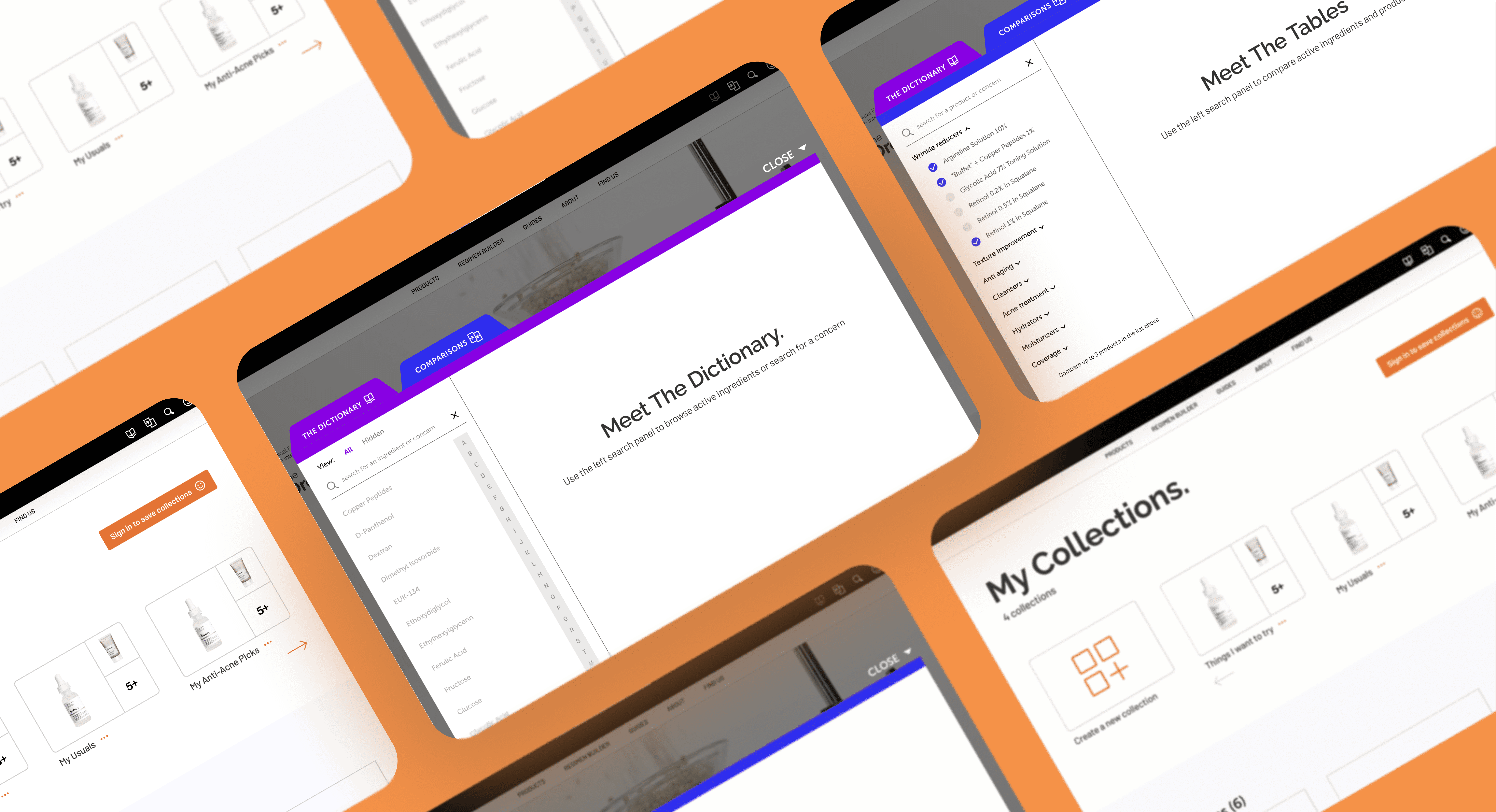
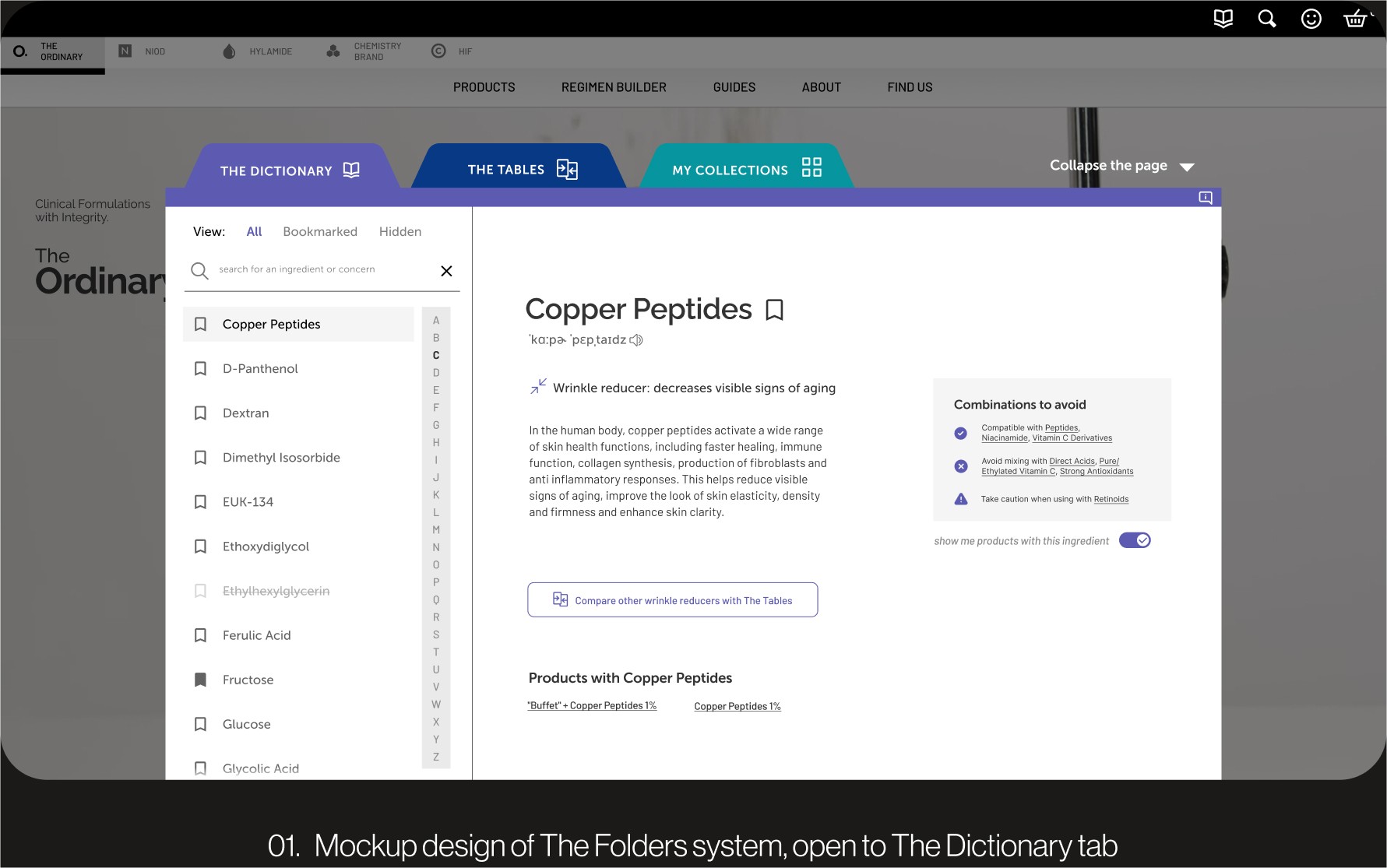
The project then evolved into The Folders: a collection of three features supporting the education of skincare science. The Dictionary was paired with The Tables, a platform allowing users to compare ingredients and products, and The Collection, a platform helping users organize their favourite for post-purchase. Though this version supported user needs, we determined that it could be further improved.
SEE THE PROJECT SLIDE DECK
Iteration 2: The Folders
Dictionary+ began as an encyclopedia explaining all the ingredients found in The Ordinary’s products and the user would enter this at the product-browsing stage. However, we realized that users needed more support to understand ingredients that the dictionary did not provide.
SEE THE PROJECT SLIDE DECK
04
SOLUTION
The Dictionary: A platform creating learning opportunities
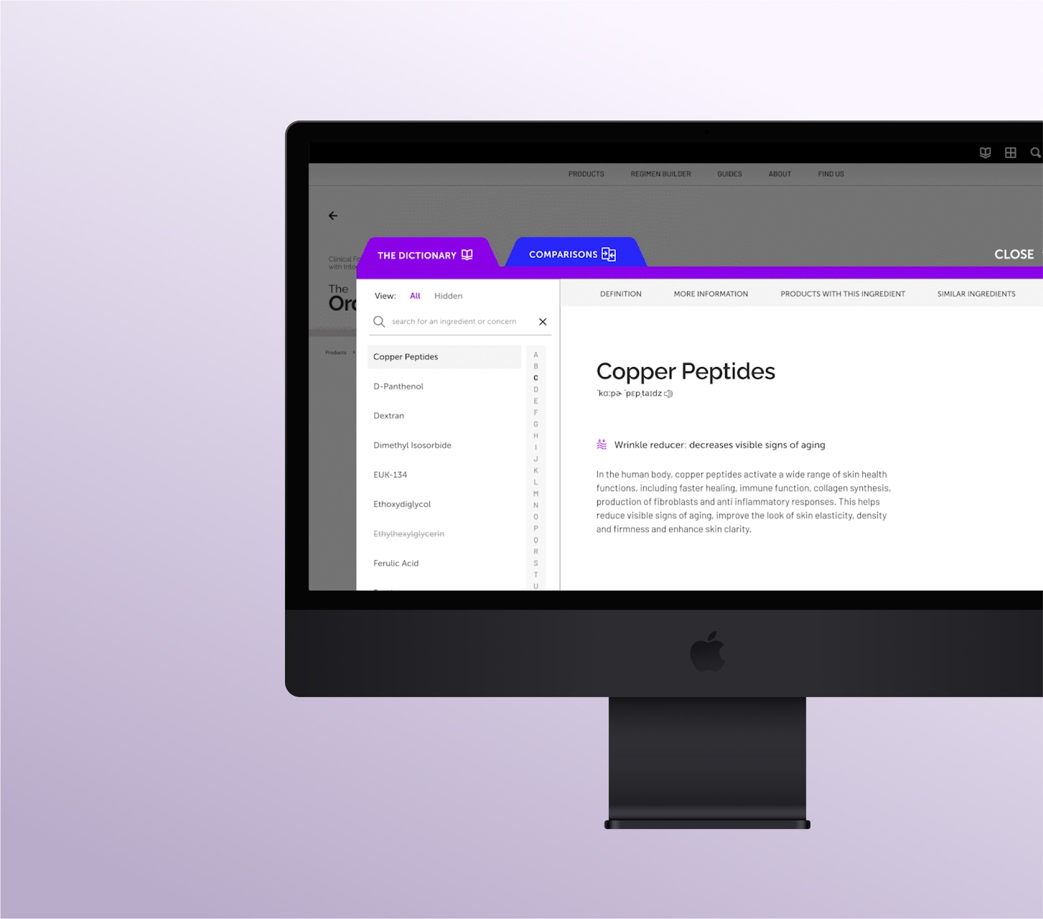
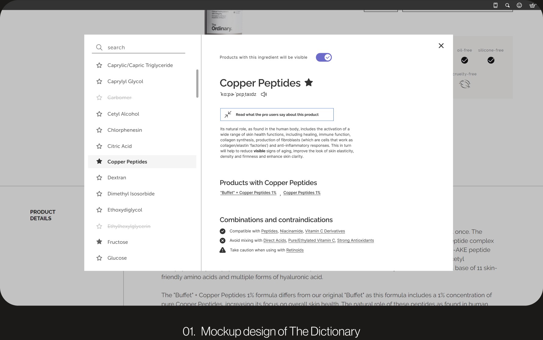
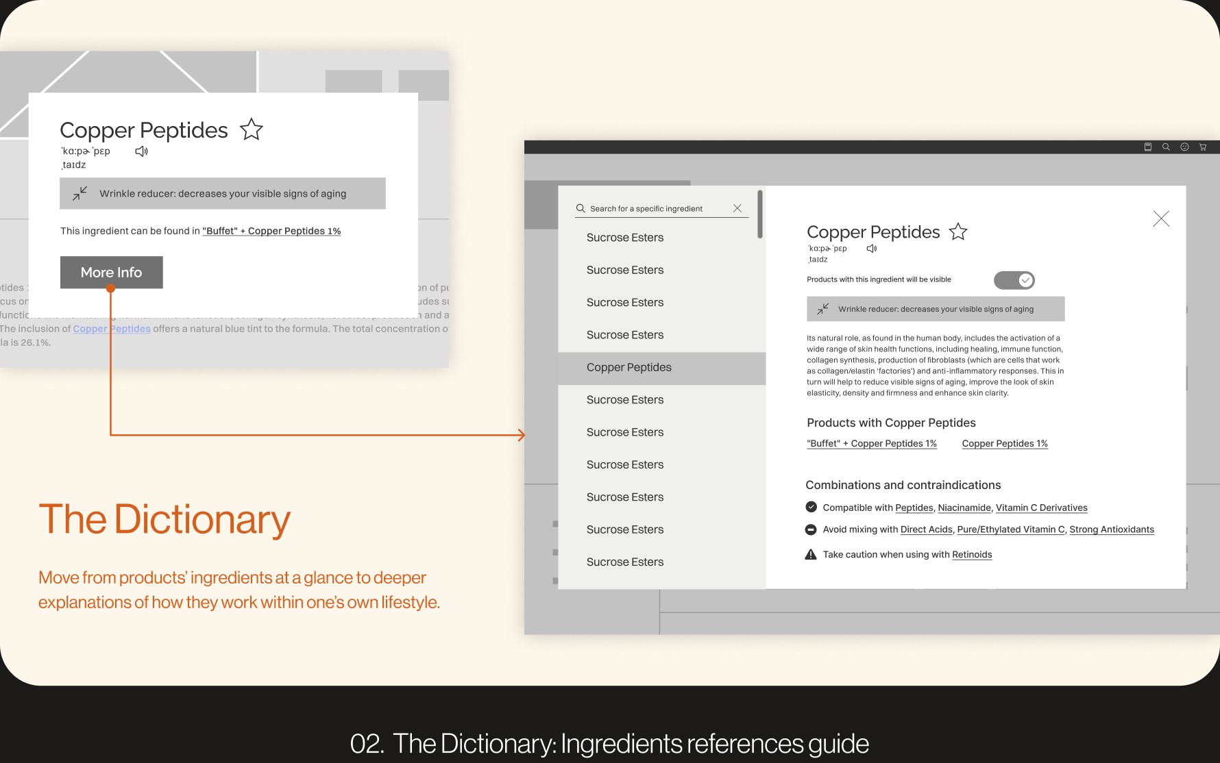
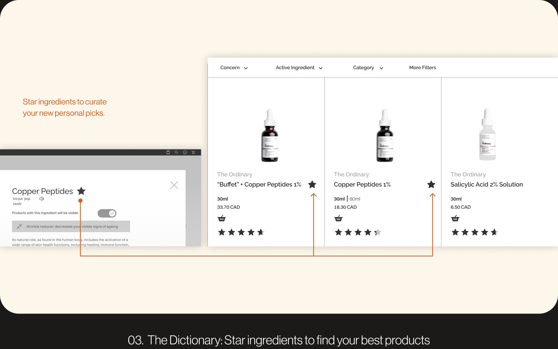
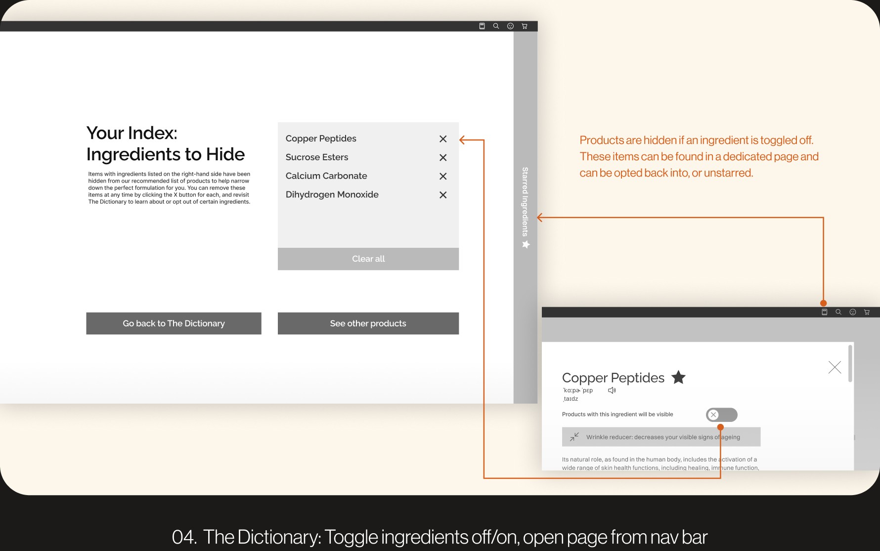
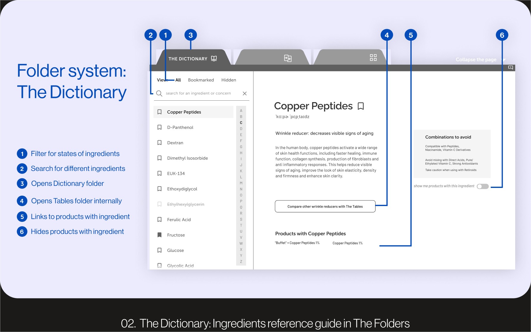
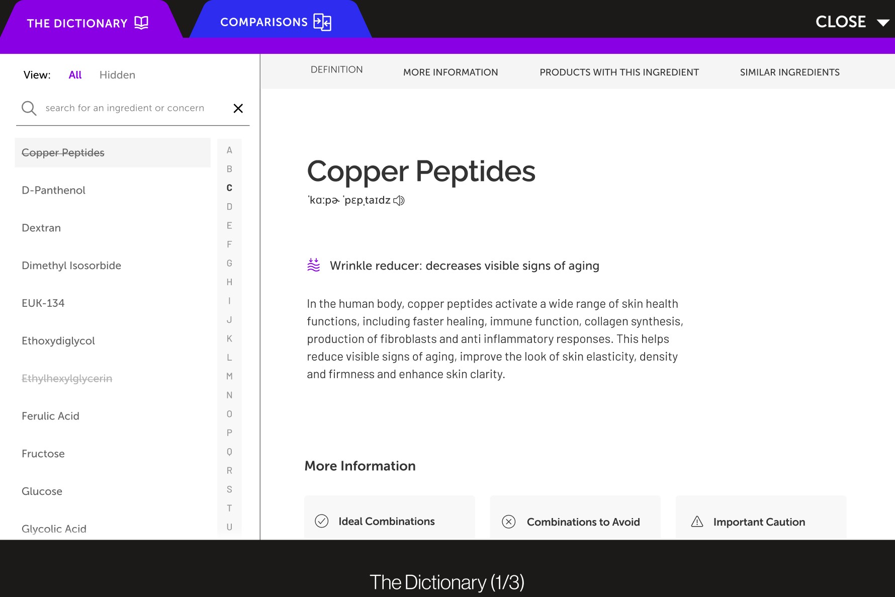
The dictionary allows users to learn about the active ingredients found in a skincare product to create user understanding and clarify scientific jargon. It can quickly be accessed through the top-right navigation bar or can be revealed when hovering over ingredient names.
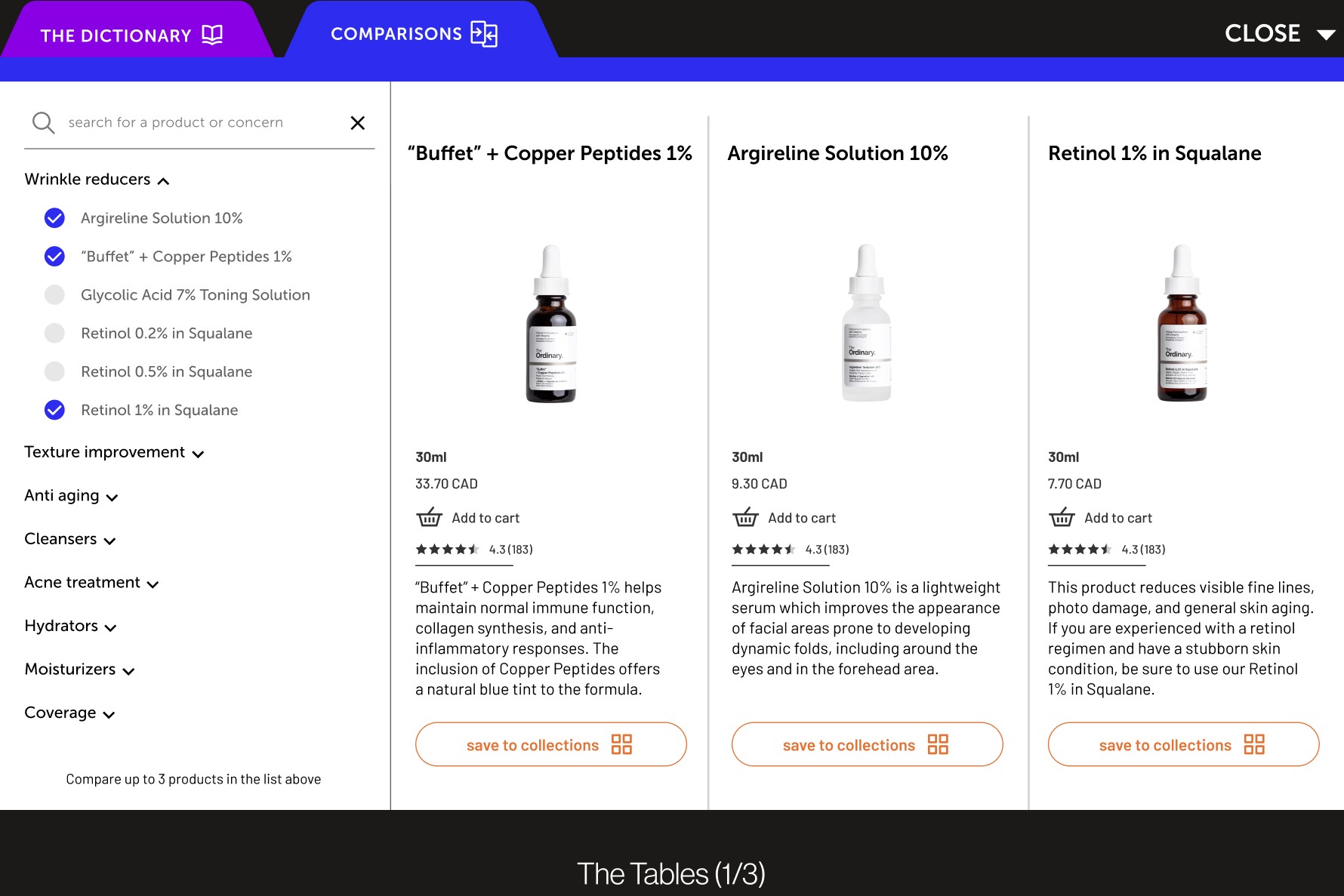
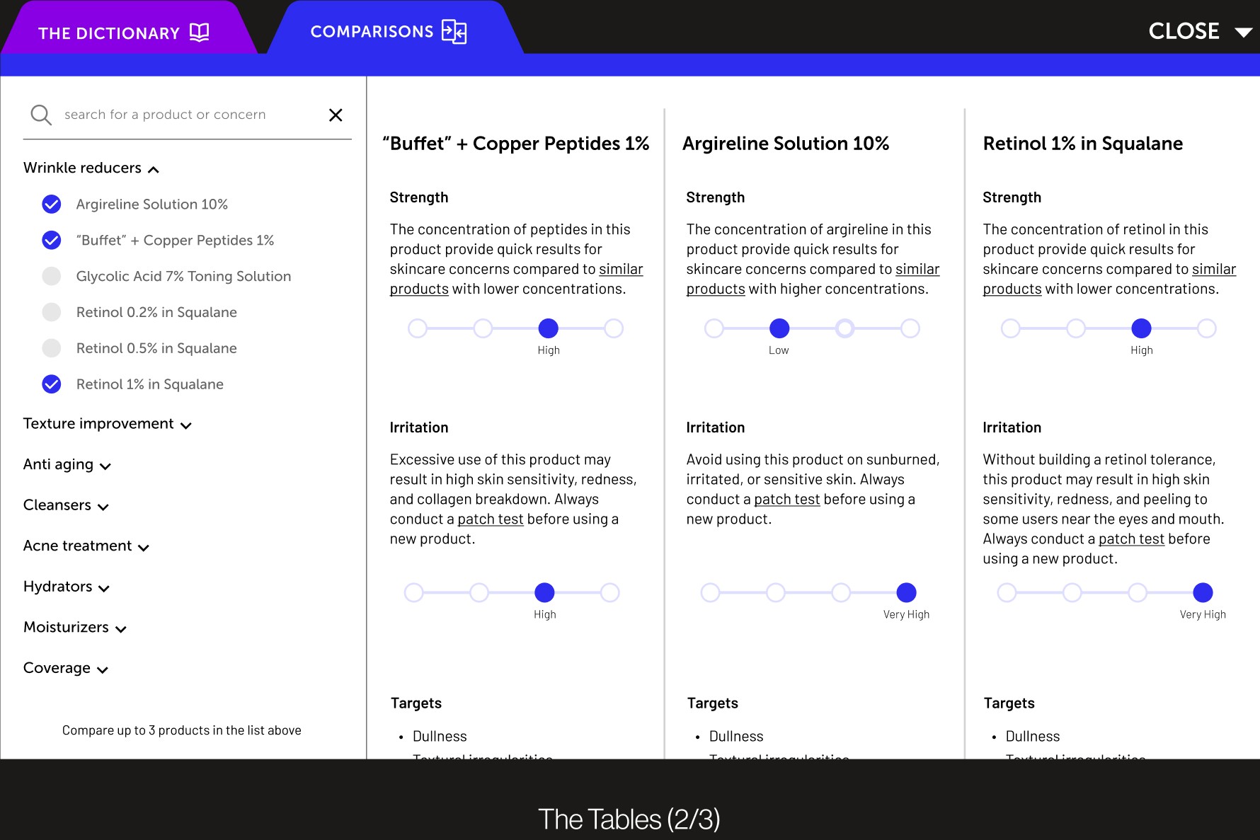
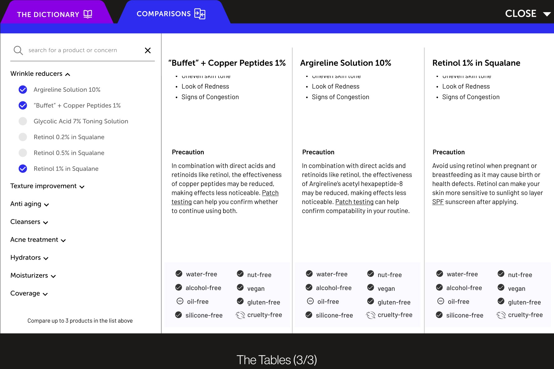
The Tables: Comparing products helps users make better decisions
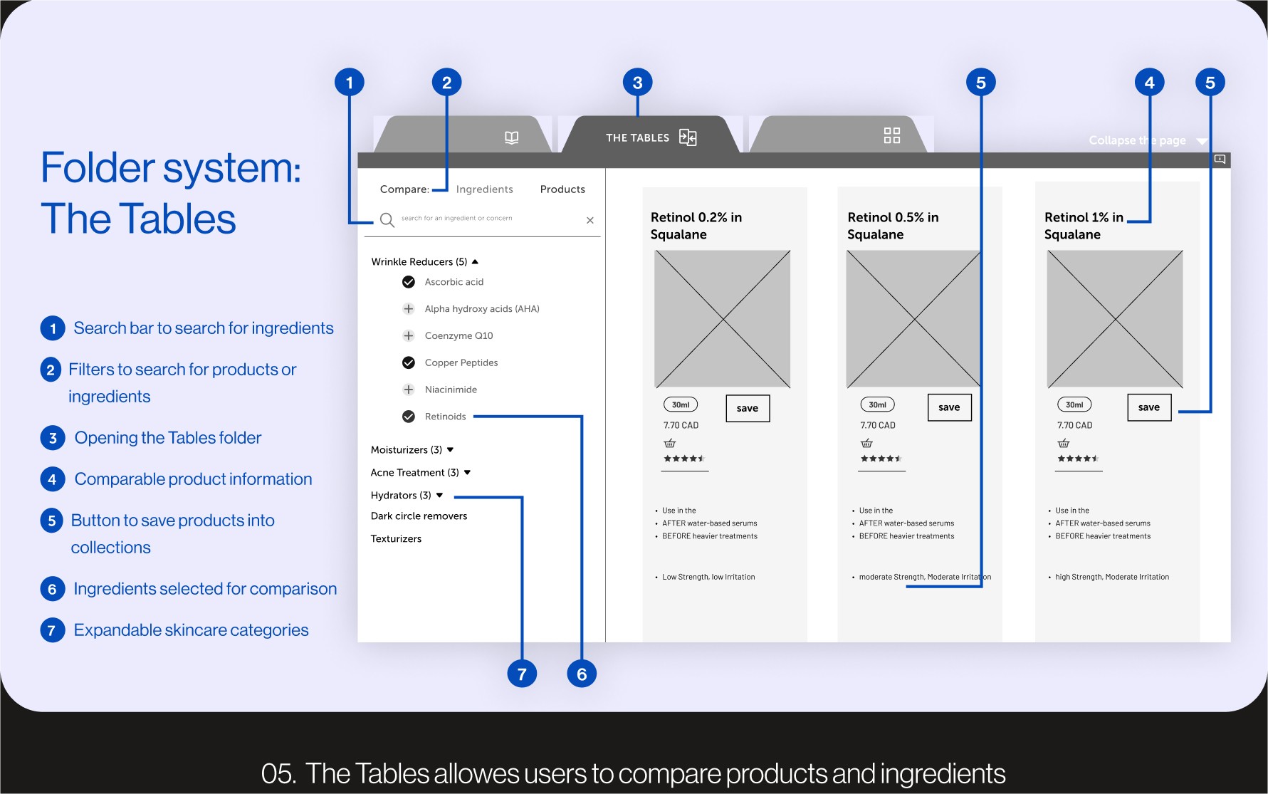
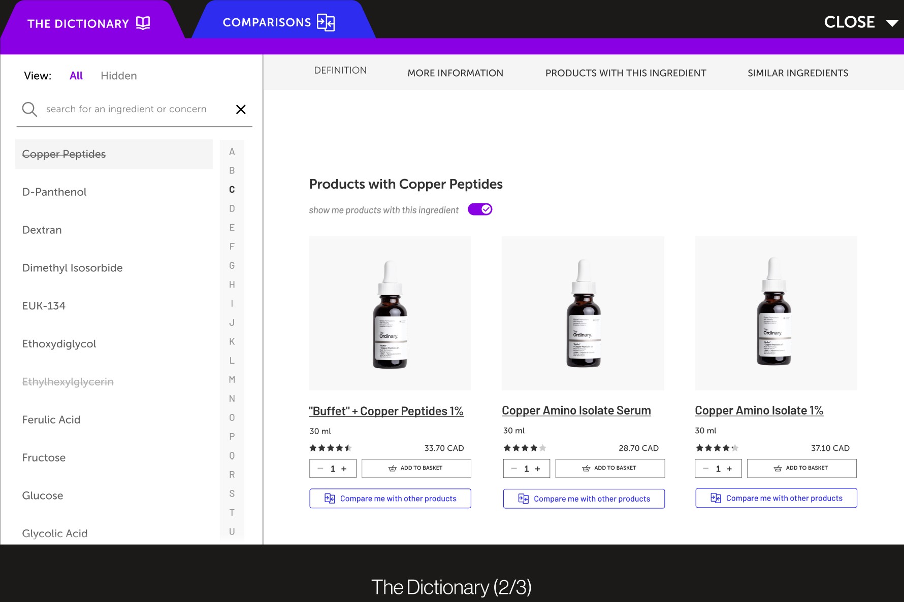
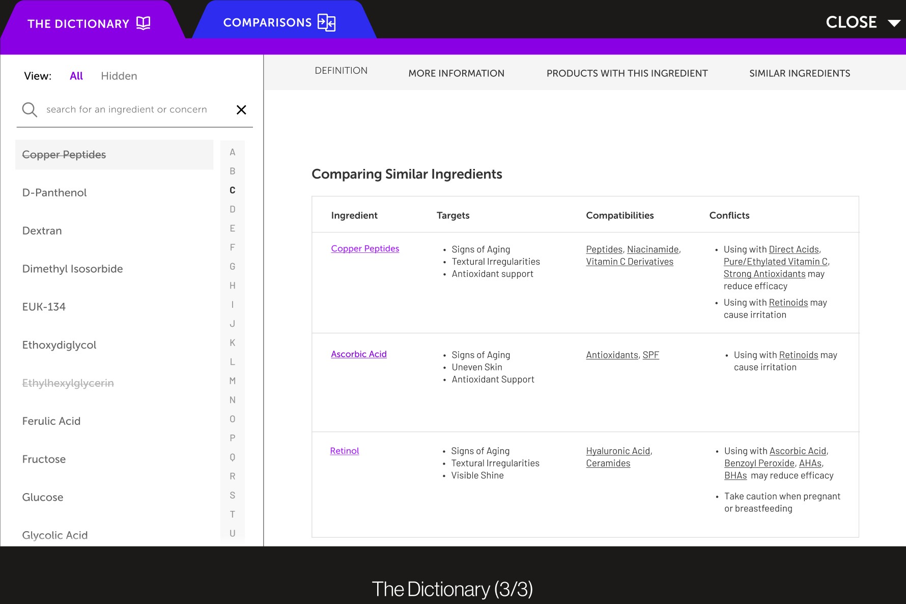
This feature allows users to make educated purchasing choices within the platform instead of relying on an external search. Users can compare products within the dictionary, allowing them to explore a product's make-up in depth in the same space. Scrollable and sectioned content provides a clear and objective break-down of each item, and gives users the ability to save products after completing their research.
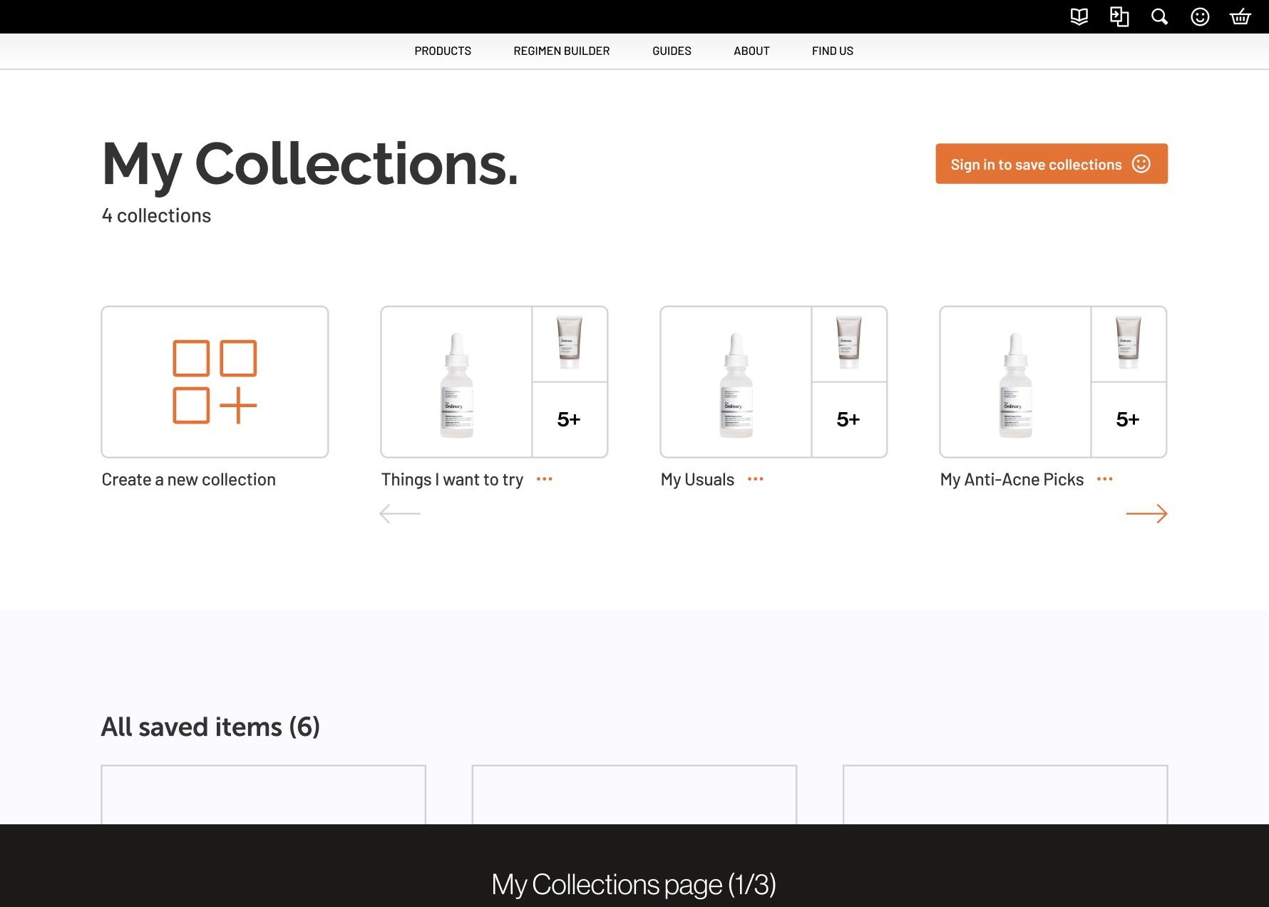
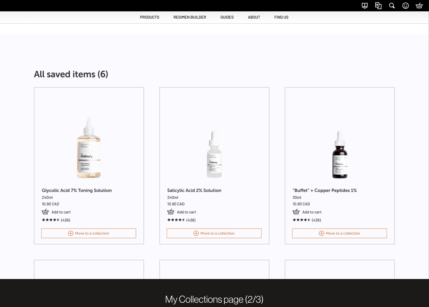
The Collections: Favourite products all in one space
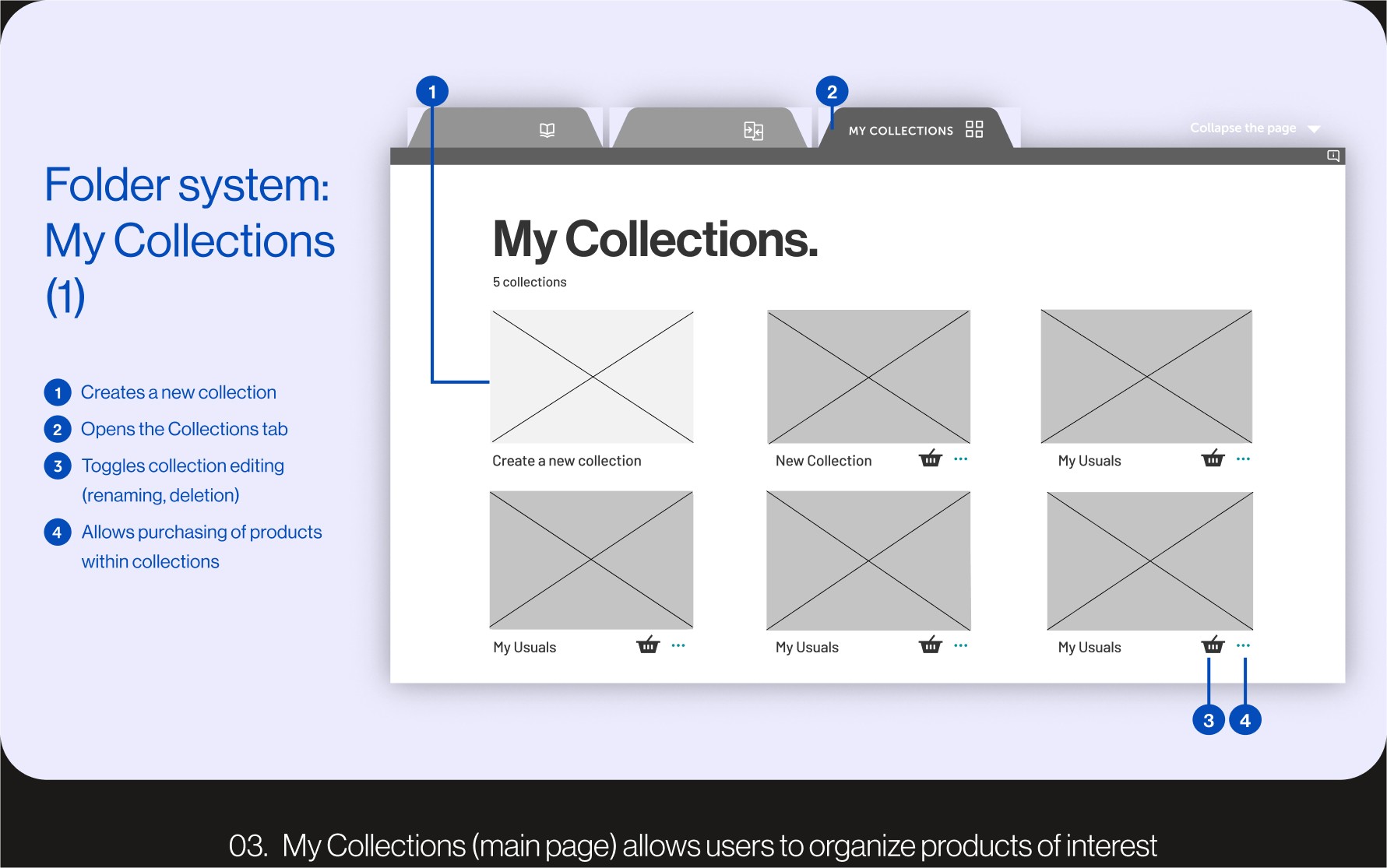
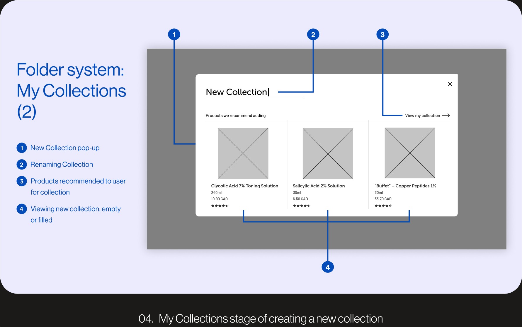
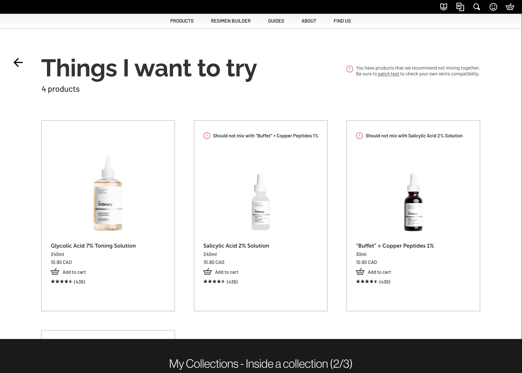
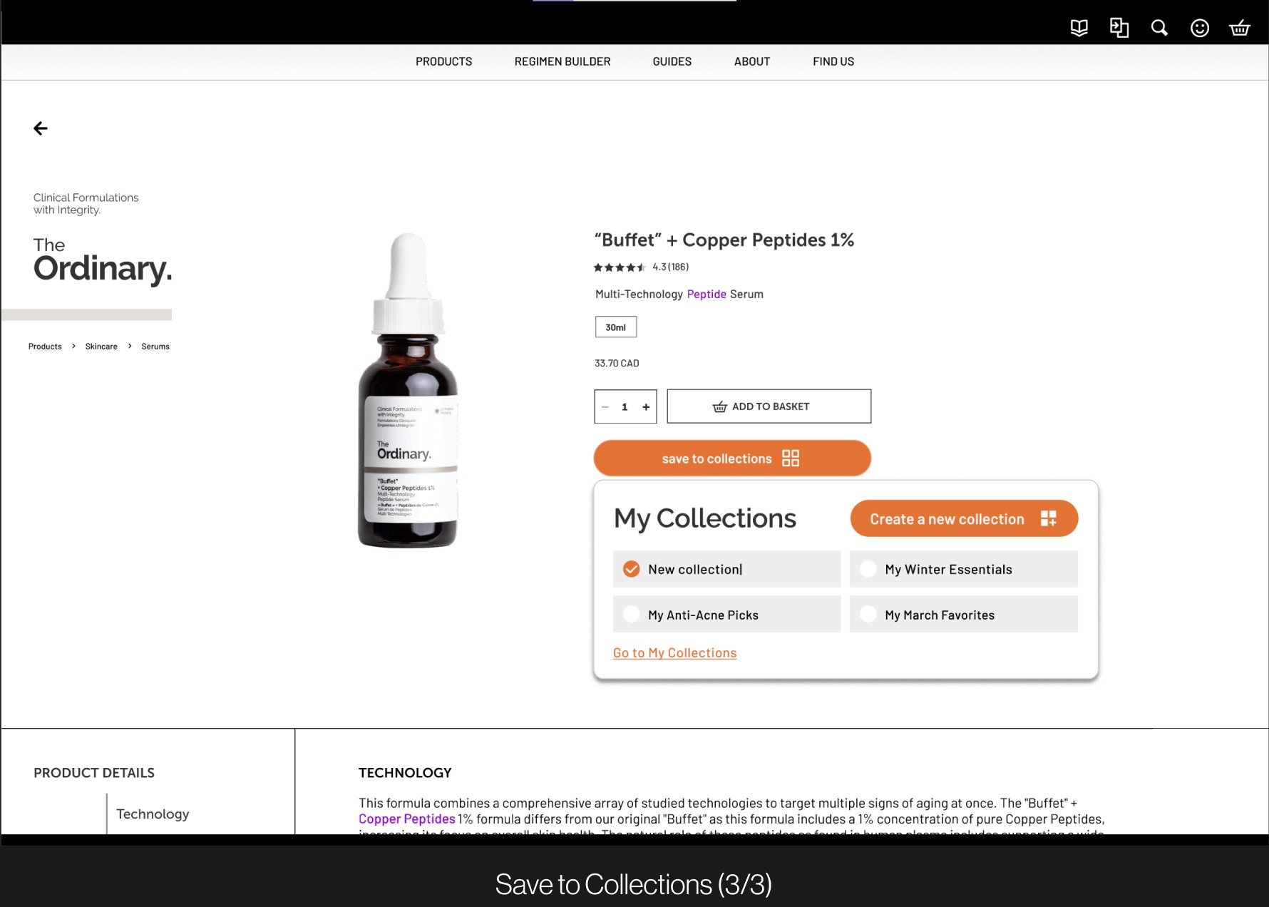
Collections allows users to organize the products they are interested in for preferred purchases. This feature is primarily accessed through the navigation bar which leads to a page to organize saved products. Within each collection, users may receive incompatibility messages if the products saved may clash with each other.
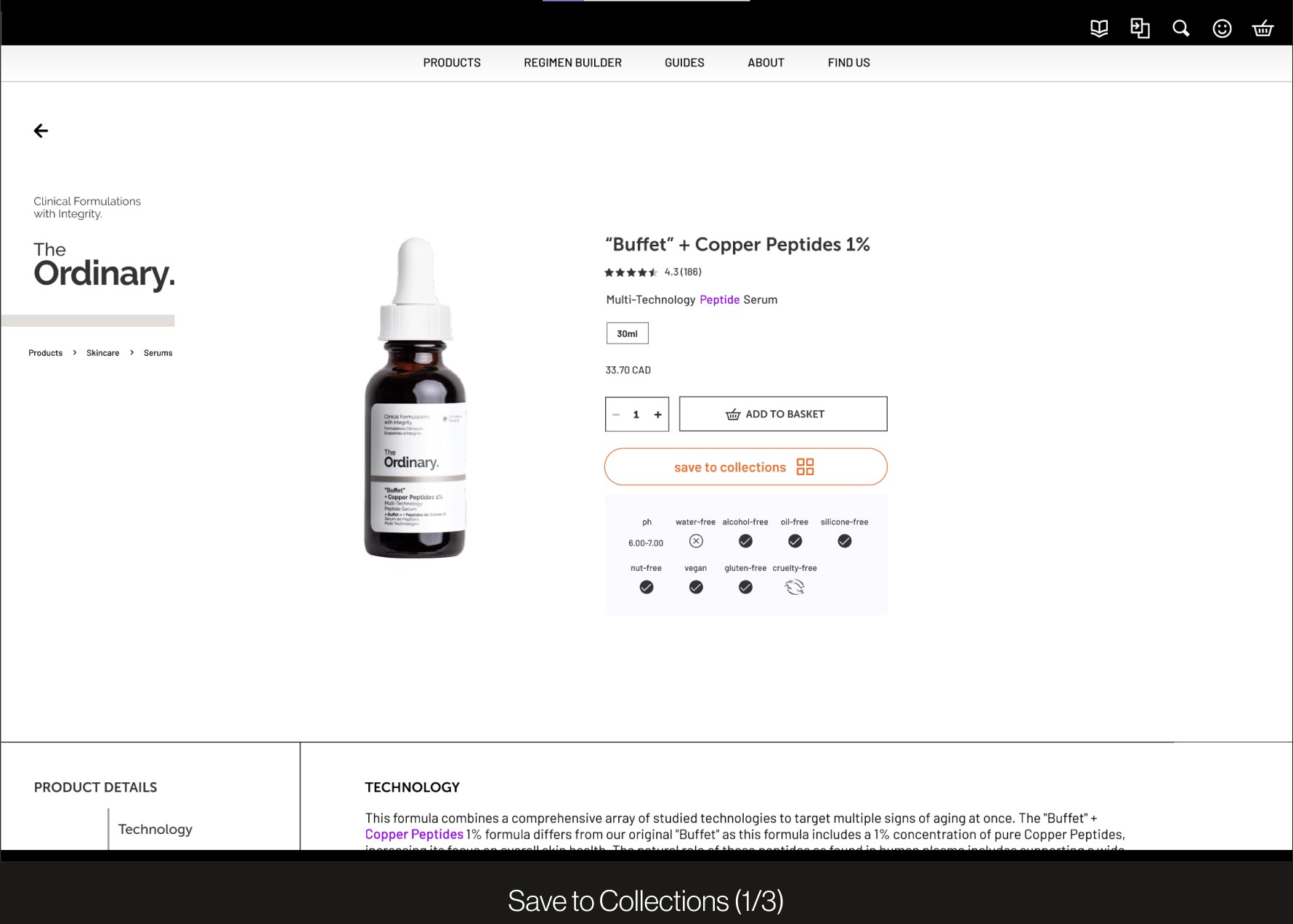
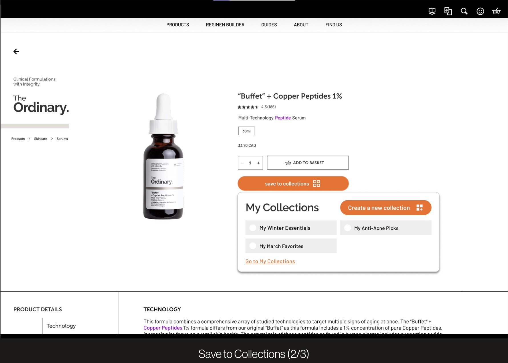
My Collections: Quick save for convenient personalization
The dictionary allows users to learn about the active ingredients found in a skincare product to create user understanding and clarify scientific jargon. It can quickly be accessed through the top-right navigation bar or can be revealed when hovering over ingredient names.
Art Direction
Colour palette
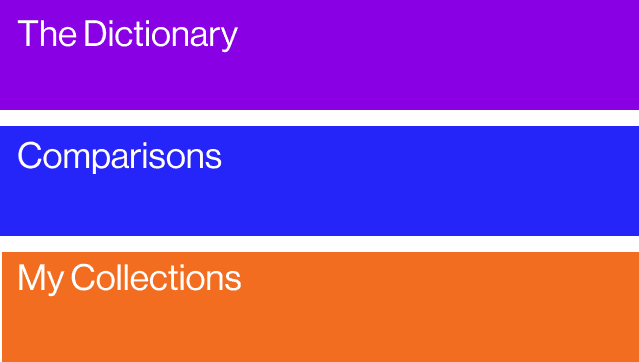
Complementary hues distinguish the identities of The Dictionary and Collections. This contrast brings greater attention towards Collection related CTAs and streamlines the saving of users’ informed choices. A warmer orange adds a friendly energy to the colder palette .
Typography
We chose low contrast, geometric sans-serifs that are legible and simple to reflect the objective values of The Ordinary. Barlow’s slightly condensed characters contrast the bolder and wider headers in Museo Sans, which establishes an overall text hierarchy between header and subheader.
05
REFLECTION
Dictionary+ : My most defining interaction design project
This was my very first interaction design project and I am very grateful for all the lessons I learned; I began this project not knowing anything about Figma or the design process and quickly built a strong foundation to establish my identity and confidence as a designer. It taught me that I am very passionate about content design and strategy. I was quickly humbled when learning how to prototype for the first time but quickly understood that there is no better way to overcome shortcomings than openminded and consistent practice.
Shoutout to my wonderful team, Nathan, Fran, and Sahar, who pulled countless all-nighters with me creating this project!
