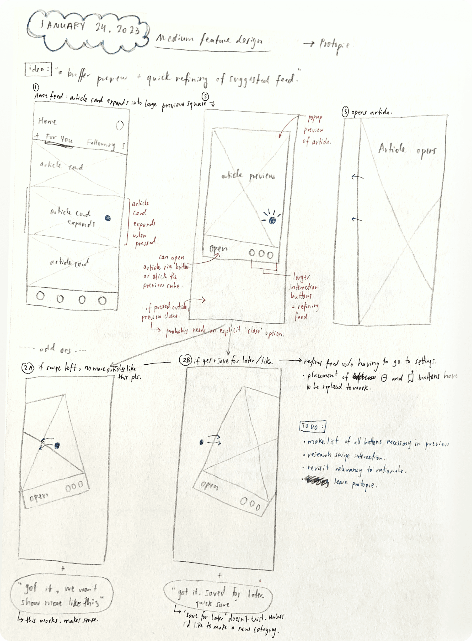
Medium: Article Preview Buffer
00
CONTEXT
Type
Interaction Design, Academic (2 Week project for Senior Design Course at SFU SIAT)
Team
Elsa Sinuhaji
My Role
Everything!
Timeline
2 Weeks (January 2023)
In the meanwhile, beware of construction!
- Elsa
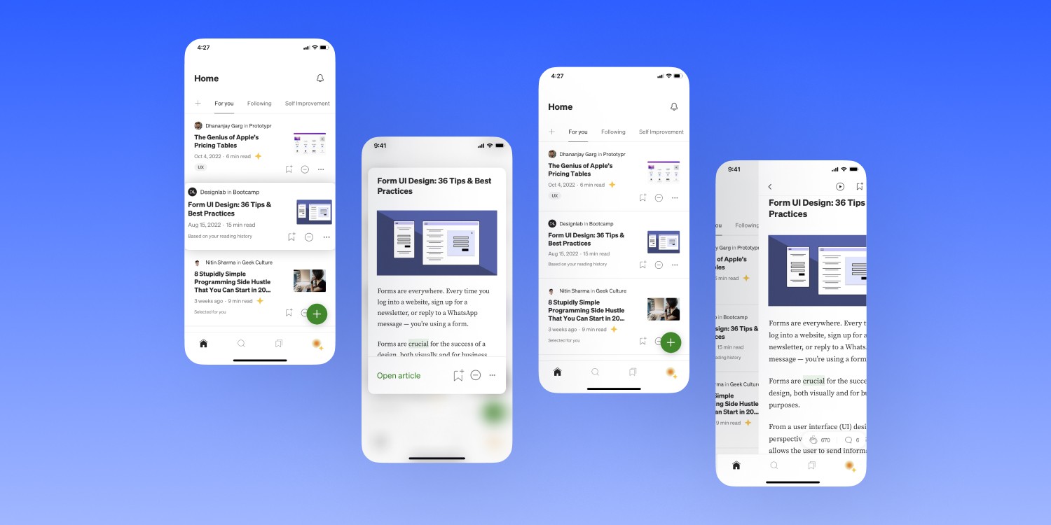
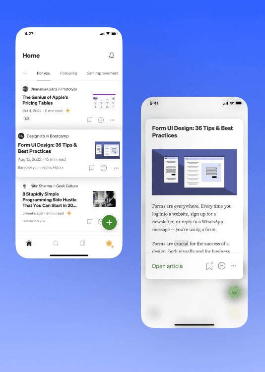
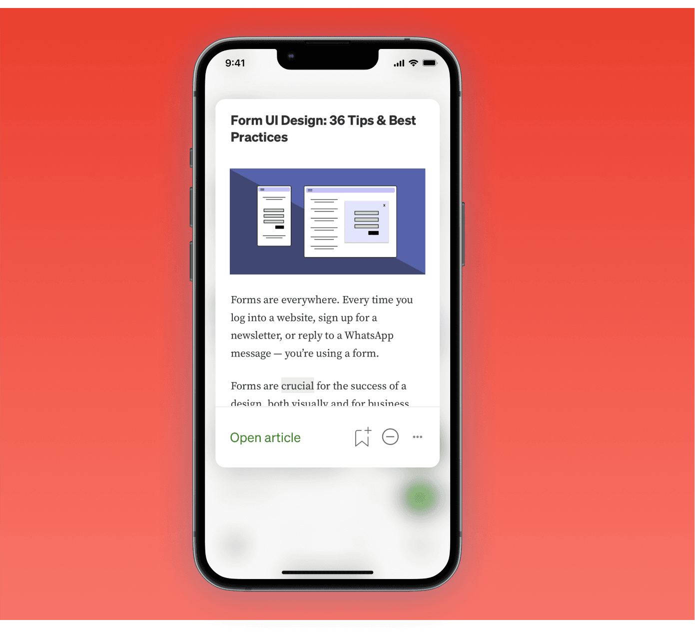
A mini checkpoint to quickly determine content relevancy.
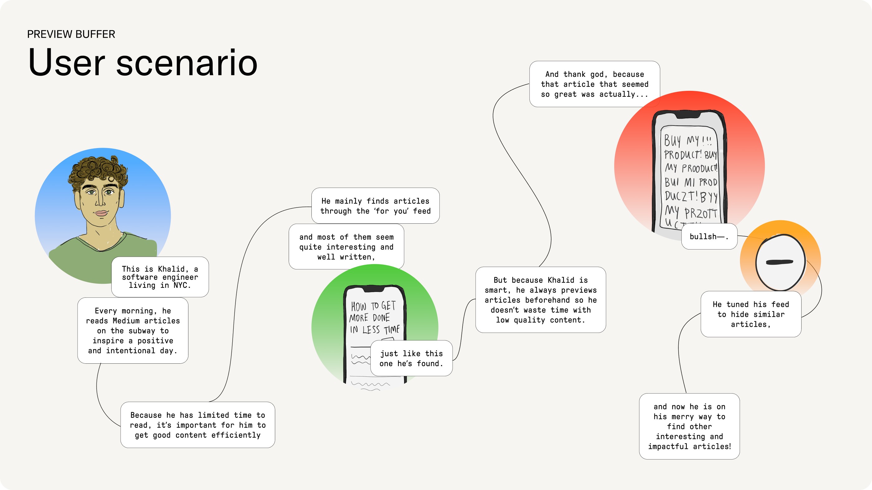
Medium is an open platform that encourages powerful conversations through reading and writing impactful articles. Users have the ability to read articles from their favourite writers and publications, as well as allowing users to write meaningful articles. This proposed feature, The Preview Buffer, focuses on the reading interaction by allowing users to preview an article before they fully commit to reading it, with the goal that they can quickly find articles that are most relevant and impactful to themselves.
01
PROJECT OVERVIEW
Learning about Medium users
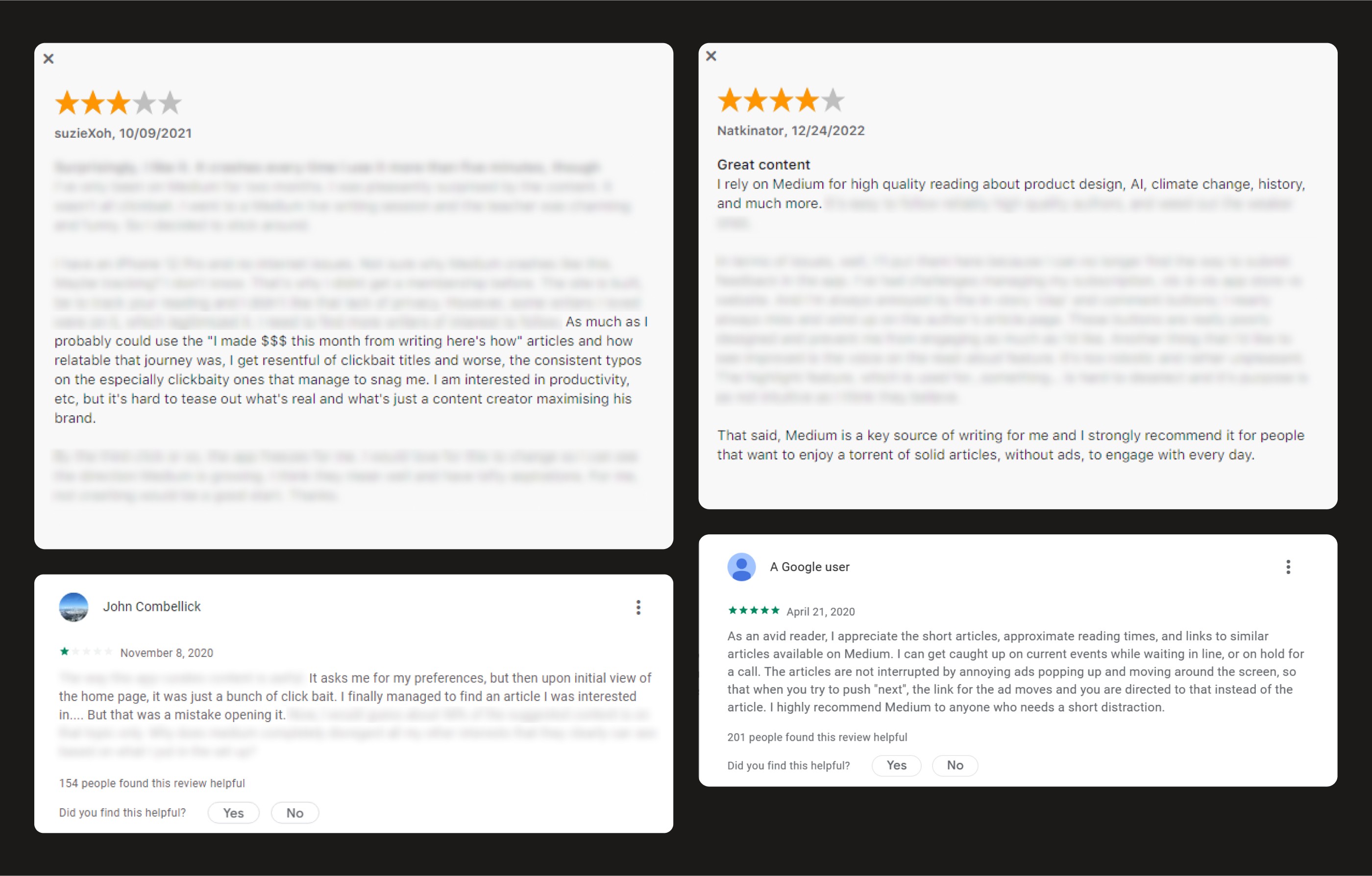
To understand the Medium reading experience, I began by interviewing 3 members of my social circle about their experiences with the app. Additionally, I sought out 28 reviews from online forums, Google Play, and the AppStore to get a full range of insights.
Narrowing our target user
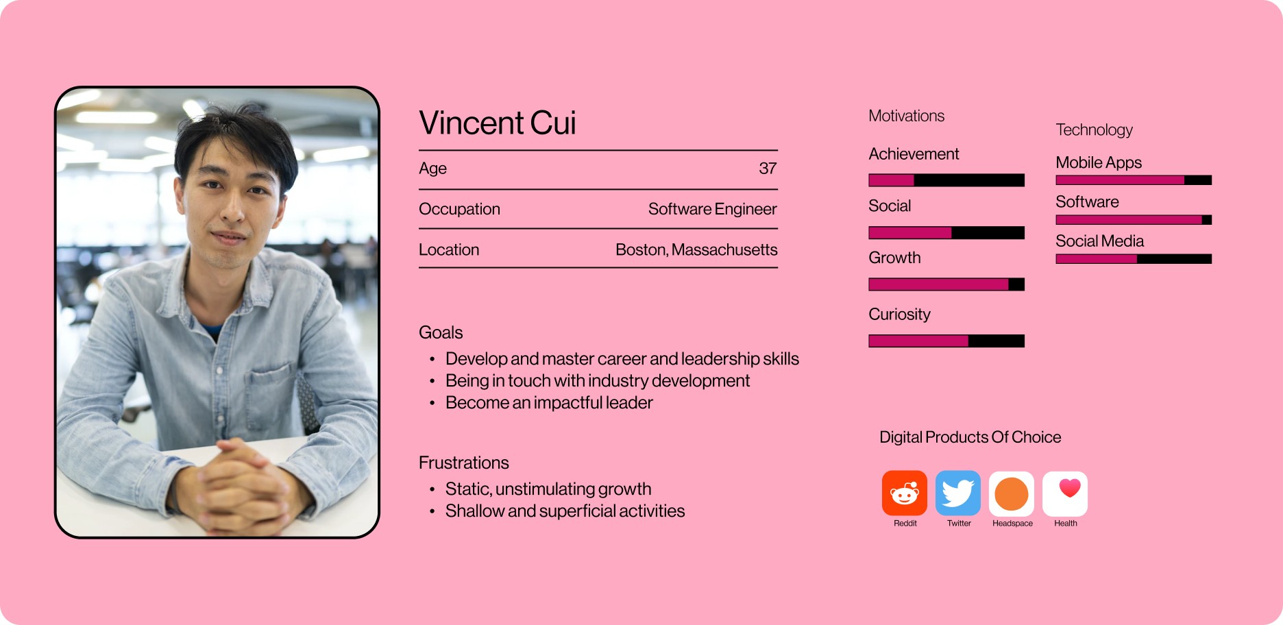
The target user for the feature is the pre-existing user demographic based on SimilarWeb's 2023 analysis of Medium and user interviews. The main demographic is described to be American males between ages 25-34 with an interest in programming, development, and other technology sectors.
02
FRAMING THE PROBLEM
How might we support readers in finding articles relevant to their interests?
User Journey Flow
Because a significant portion of the Medium-reading experience is choosing through feeds to choose an article, I determined that an intervention at Stage 3 would be most impactful. This stage is where users decide if the articles suggested to them are relevant, well-written, and interesting. It greatly influences a user's attitudes and responses to the overall app ecosystem, and it is essential that users are fed good-quality suggestions.
03
IDEATION
Beginning with a consistent interaction pattern
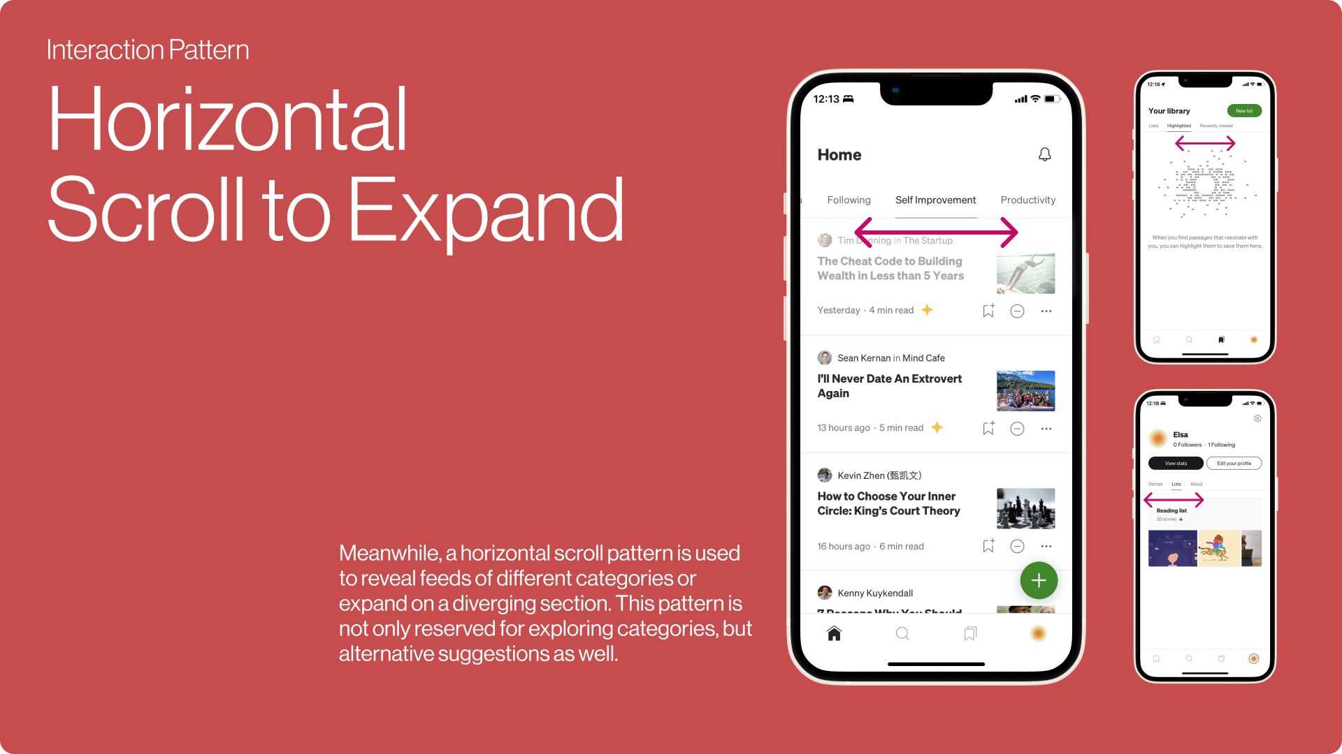
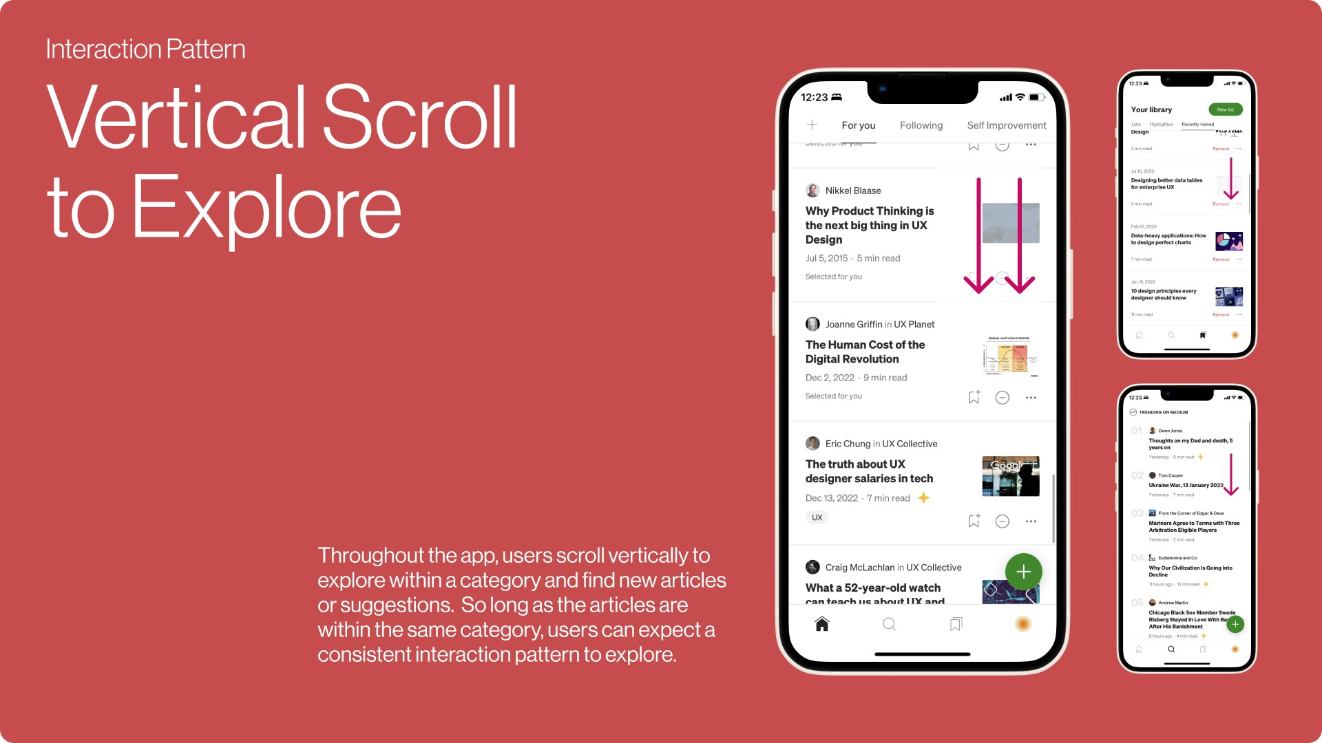
I wanted to create a subtle interface experience to prevent any systematic disruptions in the Medium ecosystem; the goal is to support a interface experience that works with the overall interaction patterns that already exist within the app, and only introducing patterns that universally recognized. To do this, I explored the main interactions and found two main patterns:
Vertical scroll is used to explore new and suggested content
Horizontal scroll is used to expand and to find new ideas
